Puffy
Ecommerce
Puffy, a $1B mattress brand, grew revenue +67% YoY after I redesigned the buying journey, not the traffic. Mobile checkout conversion rose 21%, validated by A/B test. I was the design manager for 2 years.

Repositioning Puffy as an Attainable Luxury Sleep Experience
OVERVIEW
Puffy looked like a discount store selling a premium product. I led the full-site UX transformation to attainable luxury, positioned against Purple, Casper and Nectar. Today Puffy is a $1B brand. I will not claim that climb. I claim the +67% YoY revenue the redesign drove, validated by A/B test.
Key Insights → One Hypothesis
Shoppers questioned Puffy’s premium price and got lost in a cluttered, discount-style site.

Competitor Scan
Luxury players use dark palettes and story-led visuals; Puffy’s colourful site looks unprofessional.

Funnel Audit
A three-step flow and an oversized coupon box caused last-mile doubt, spiking cart abandonment.

FullStory & User Tests
64% left after the hero because they couldn’t compare models.
If we add a premium visual language, side-by-side product comparisons, and a two-step checkout, shoppers will see higher value and complete more purchases.
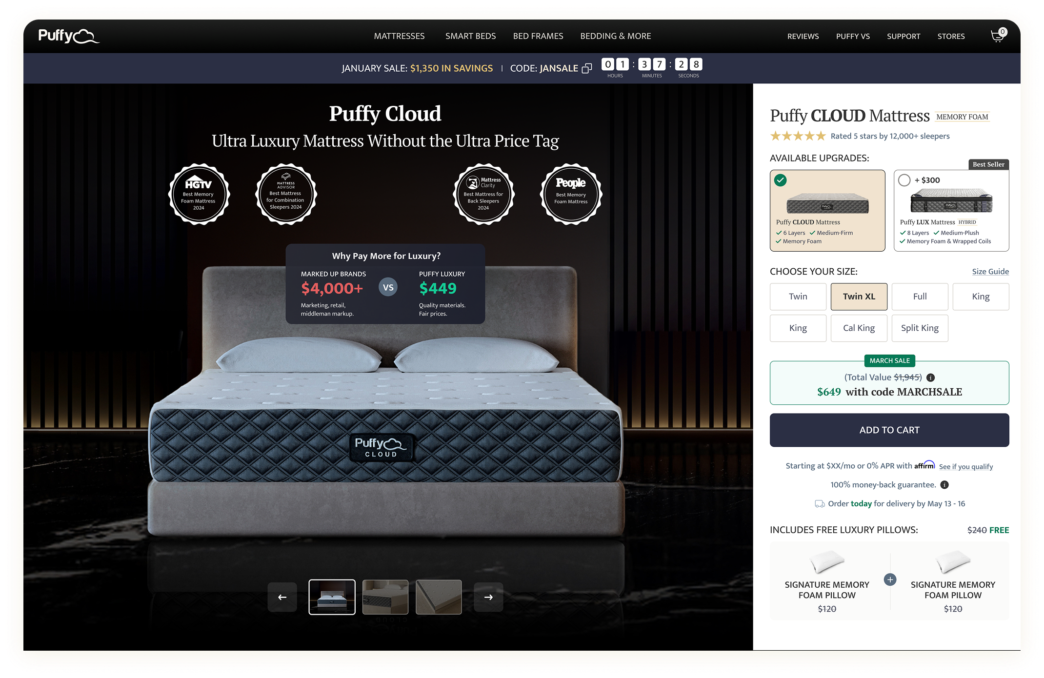
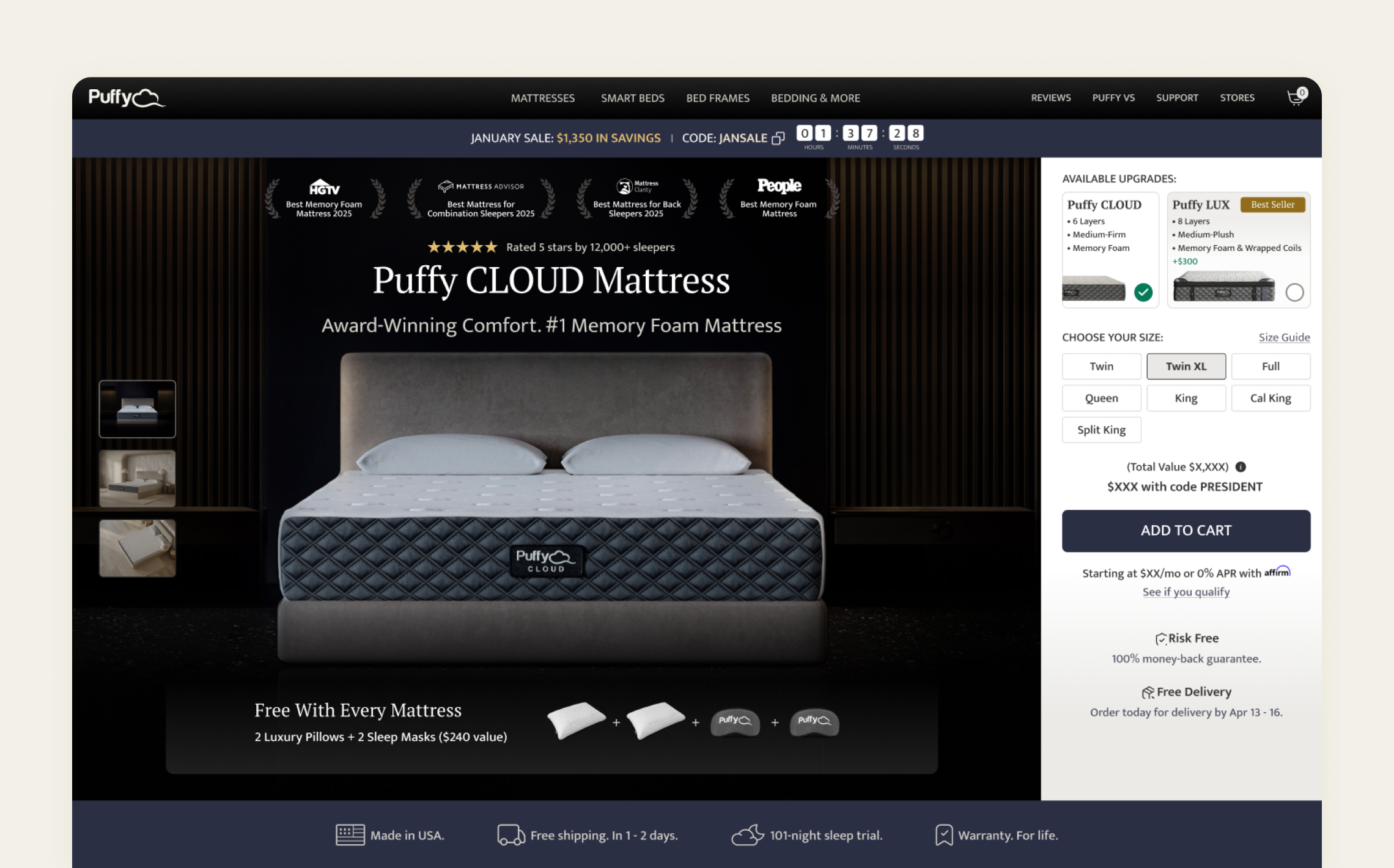
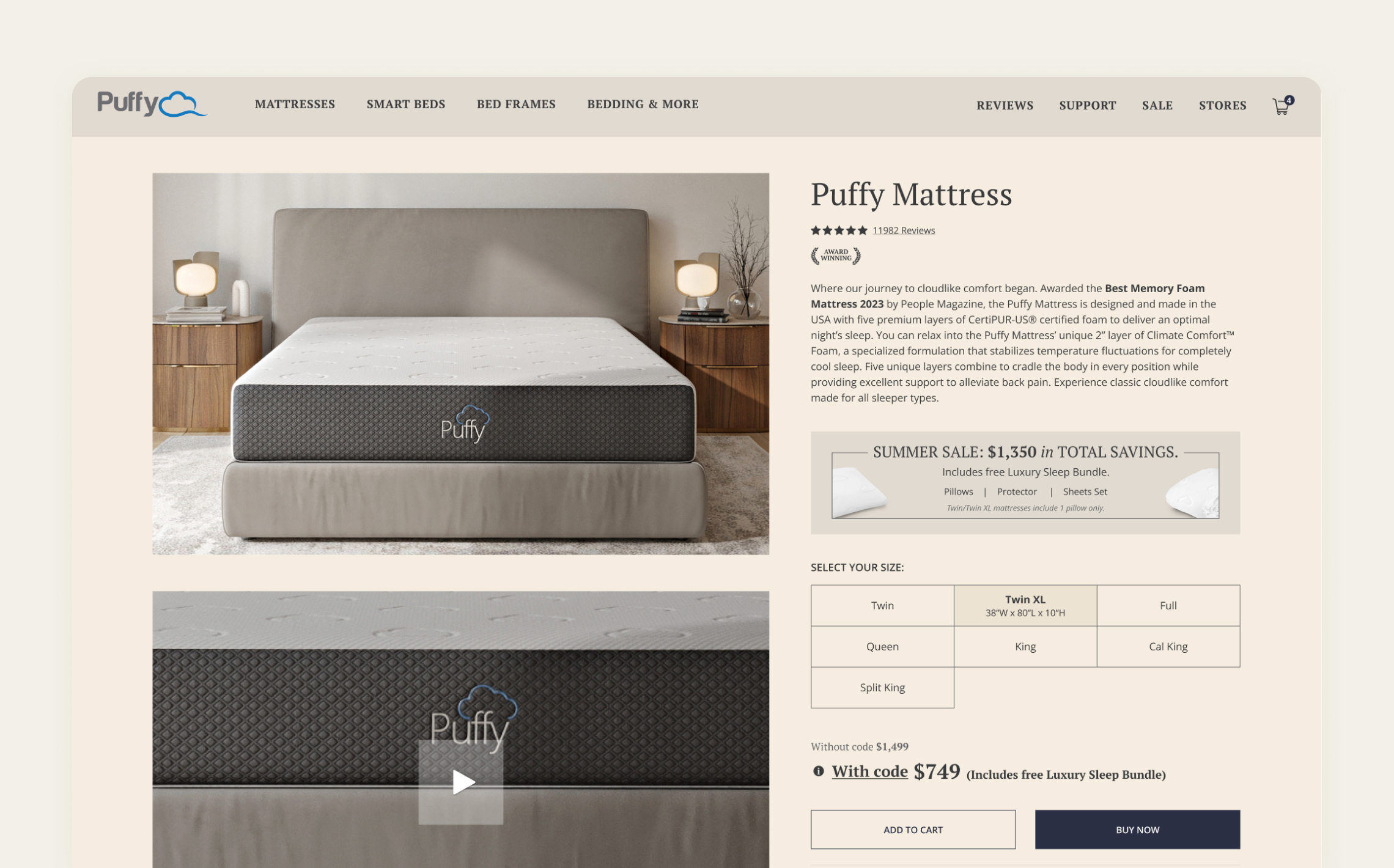
Here's How I've Transformed User Experience by Addressing Major Friction Points.
Drag the slider below to see the comparison page before and after the redesign.
NEW DESIGN
OLD DESIGN
Challenge
EXISTING PRESENCE
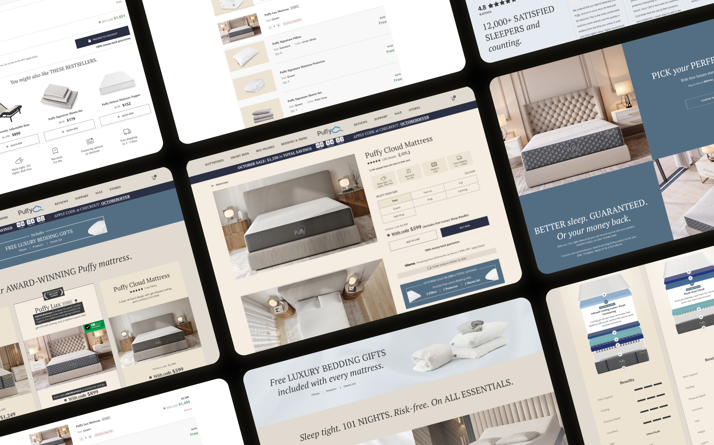
The current branding lacks consistency - featuring clashing colours, varied styles, and a boutique-like design that overwhelms rather than guides. No Design System in place.
There’s poor visual hierarchy and no cohesive eye flow. Core UX best practices are missing, making the site feel like a generic online store with no clear branding or strategic presence.
My Approach & Solution
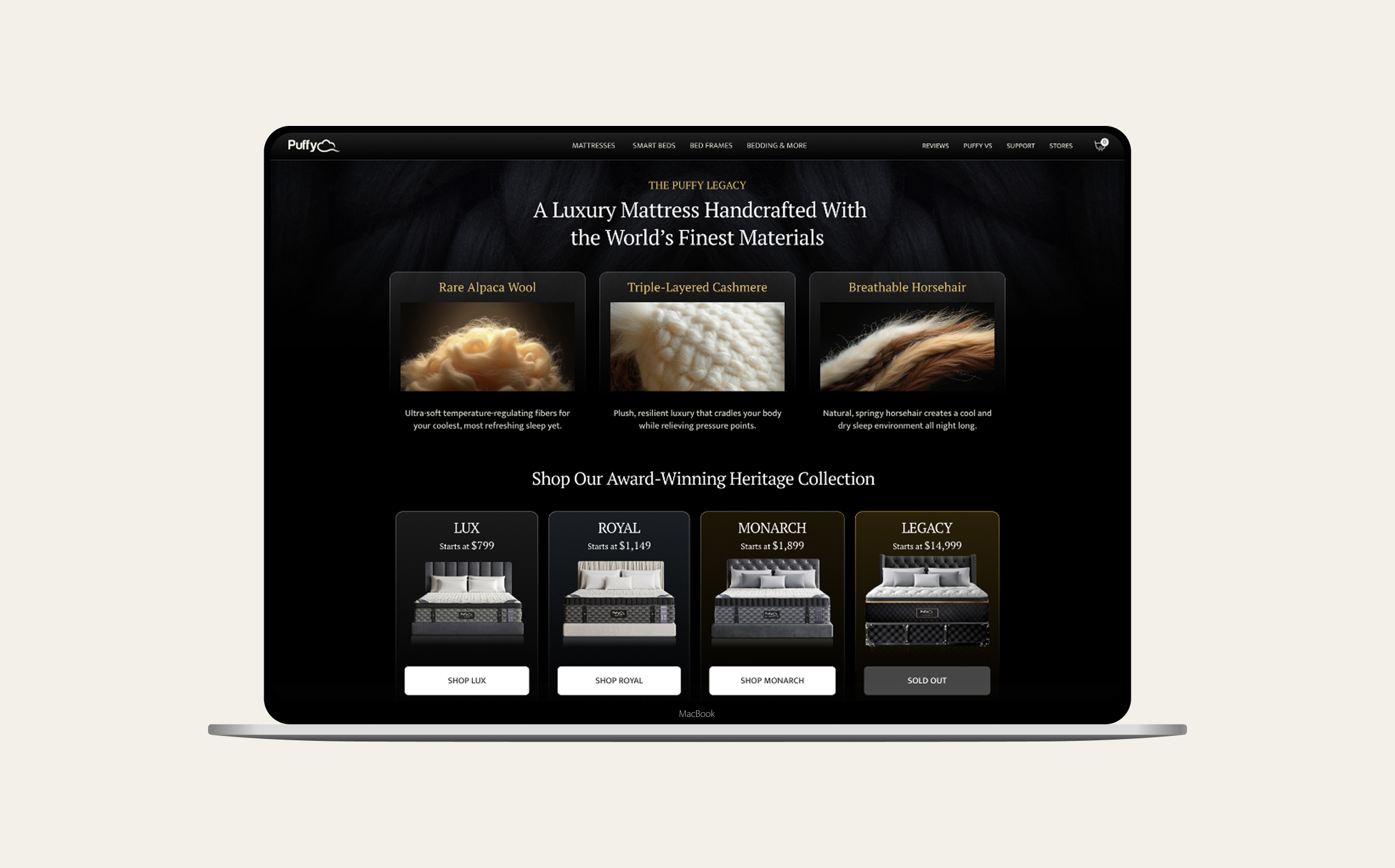
1. Dark-luxe UI refresh
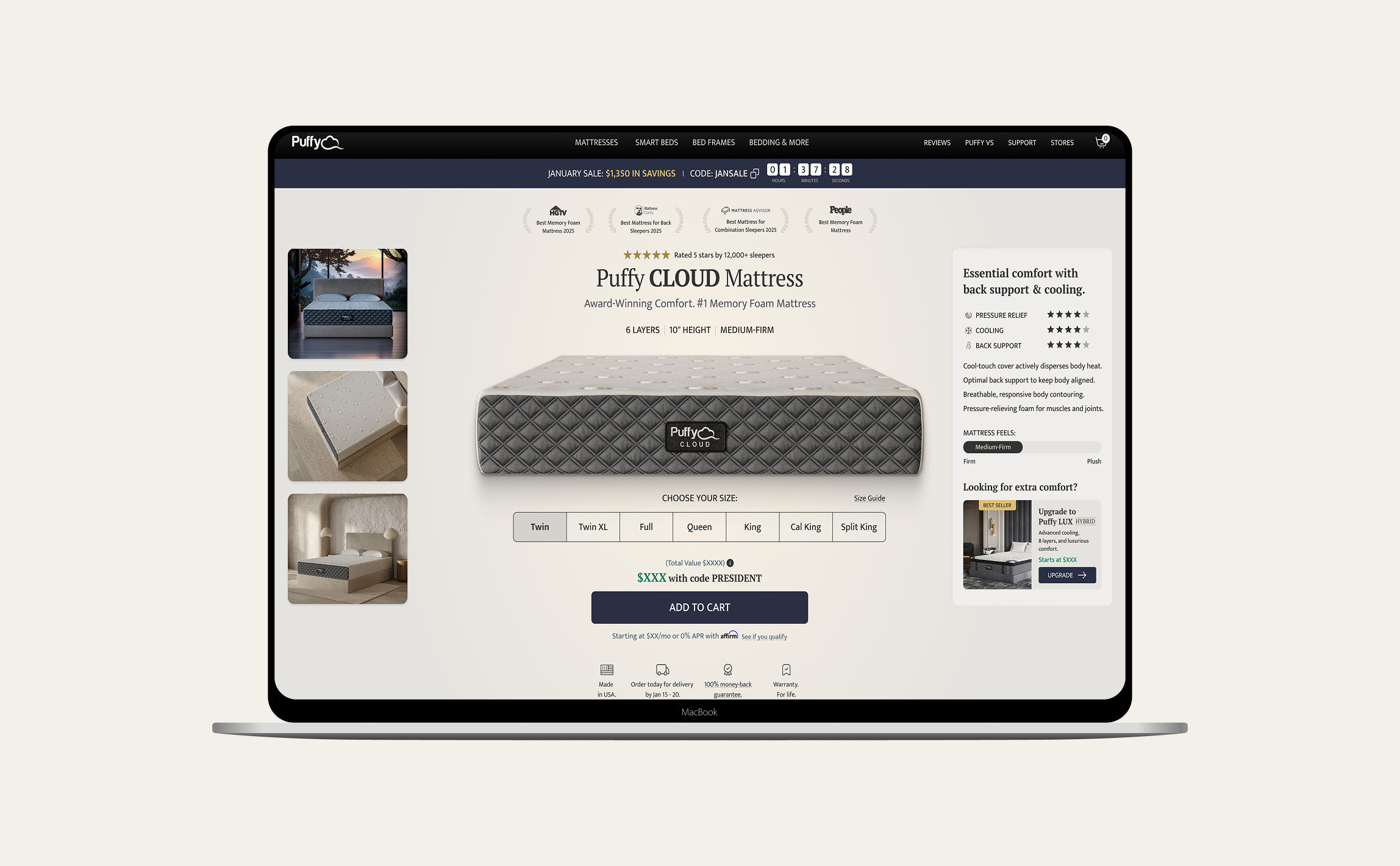
Dark UI with warm beige and muted-gold accents replaces the loud discount palette, signaling boutique luxury. The deep canvas clears noise and steers eyes to product details.
Macro shots of premium materials anchor price and prove value.
Cleaner Comparison Experience Drives +17% Page Revenue
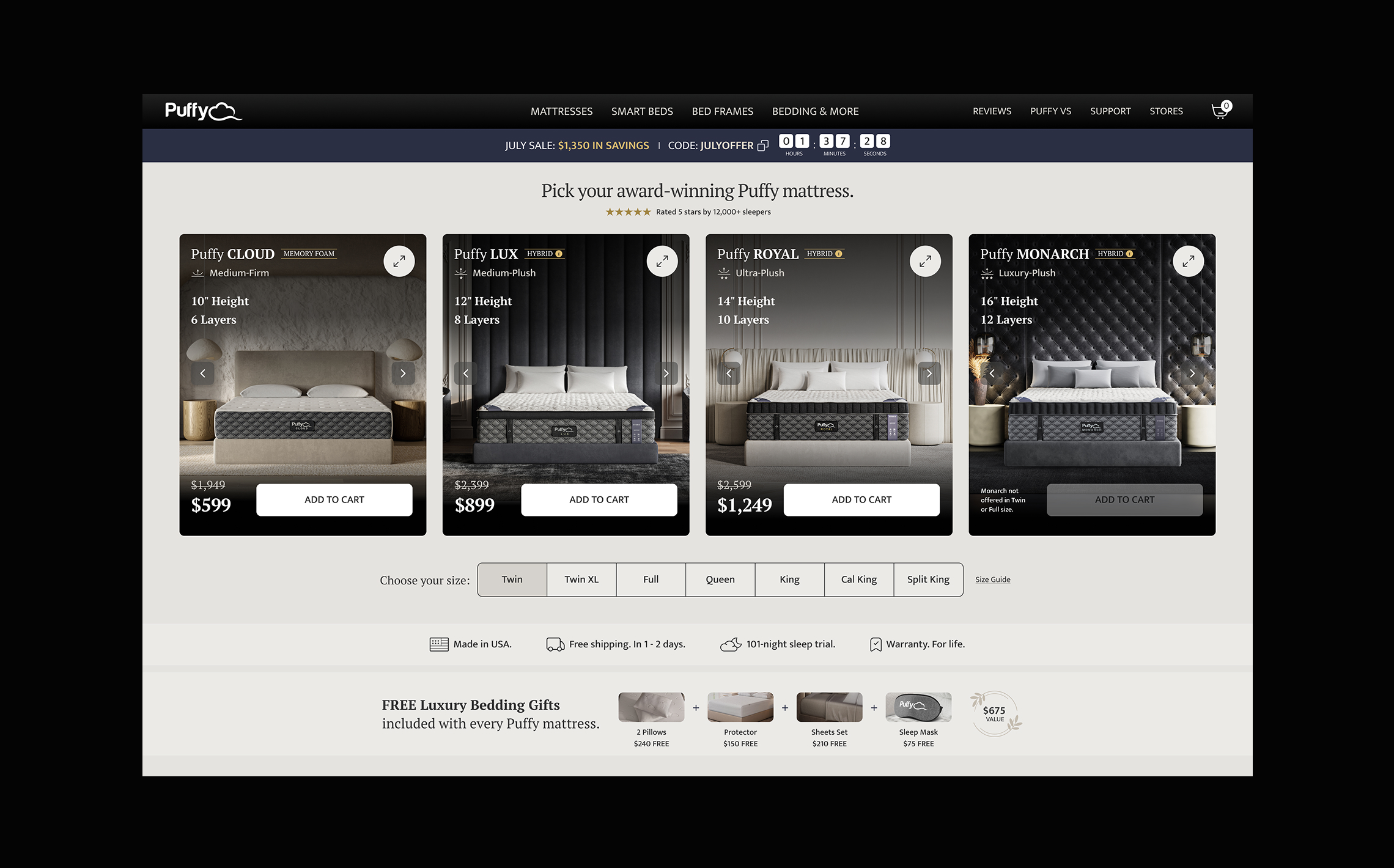
2. Modular comparison cards
Modular comparison cards replaced the cluttered spec table with roomy, swipe-able blocks and full-bleed imagery.
A sticky side-by-side scroll reveals key differences instantly, slashing decision fatigue and driving a +17% lift in page revenue.
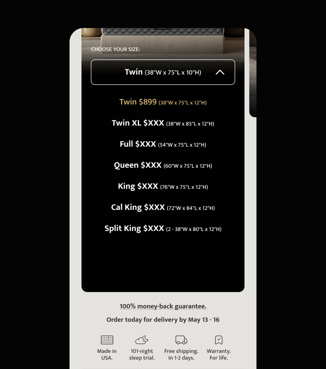
Friction-Free Mobile Checkout Drives +21% Checkout Conversion
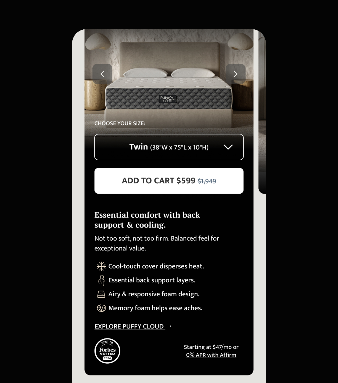
3. MOBILE-FIRST CHECKOUT
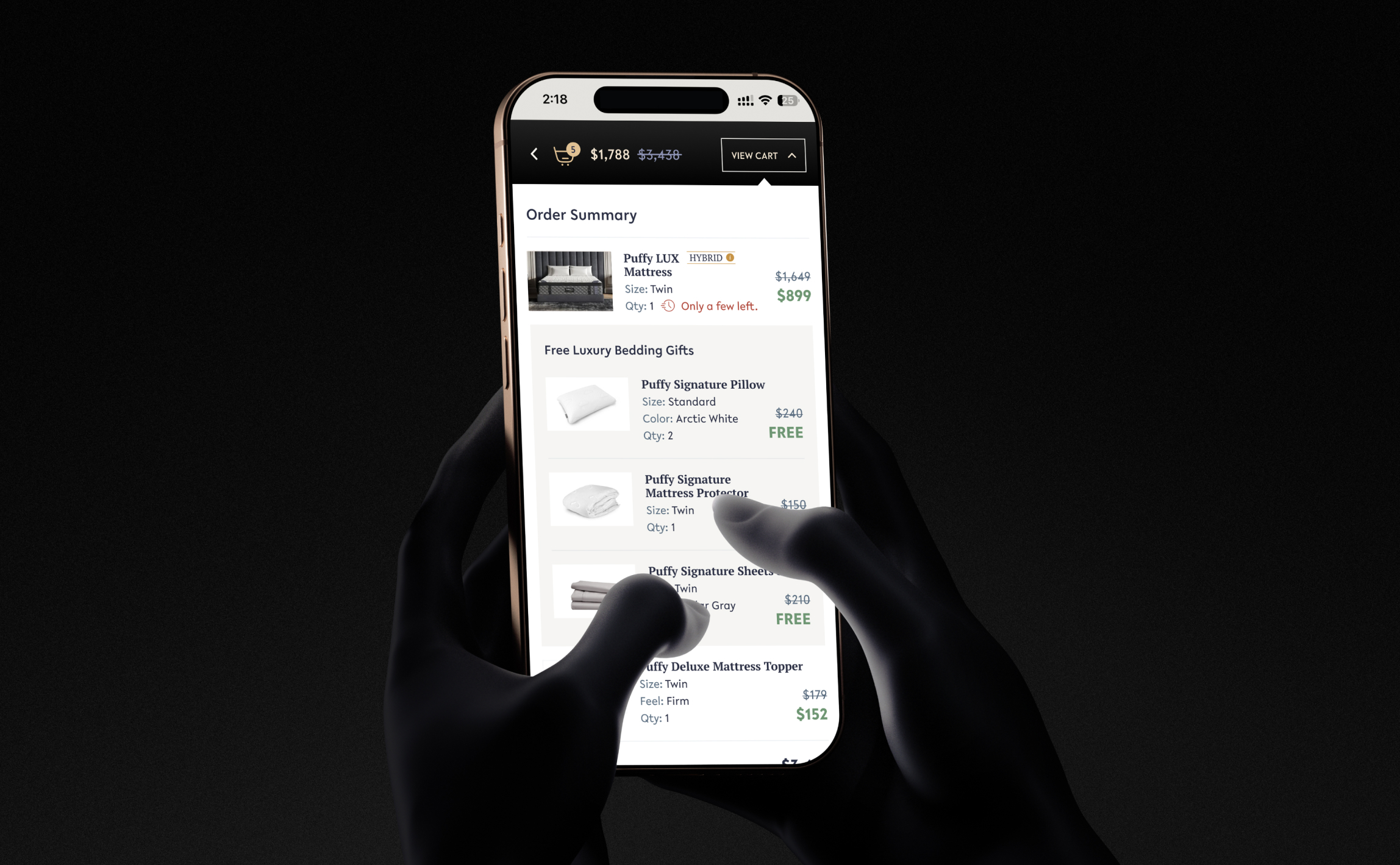
Three clunky steps collapsed into two thumb-friendly screens: express wallets up front, and a sticky order summary that’s always in view.
The coupon box now appears only at review, ending mid-flow deal hunting.
This lean flow shaved 18sec off purchase time and lifted mobile checkout completions by 21%. Cart abandonment fell 14%.
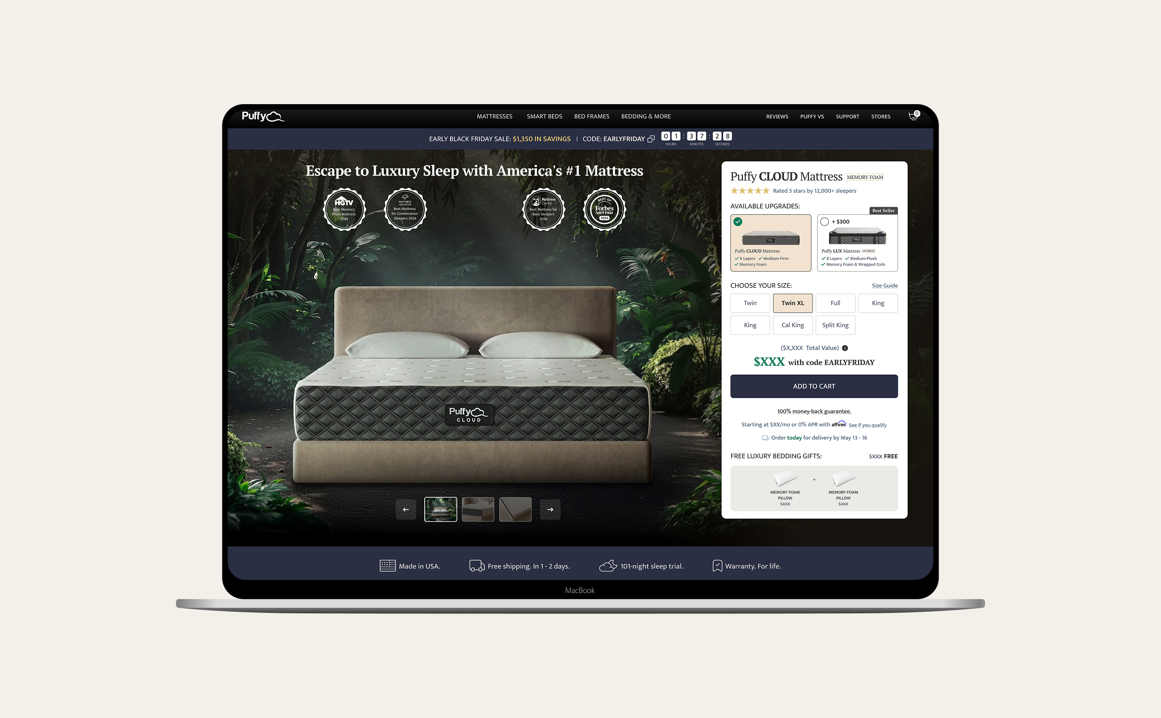
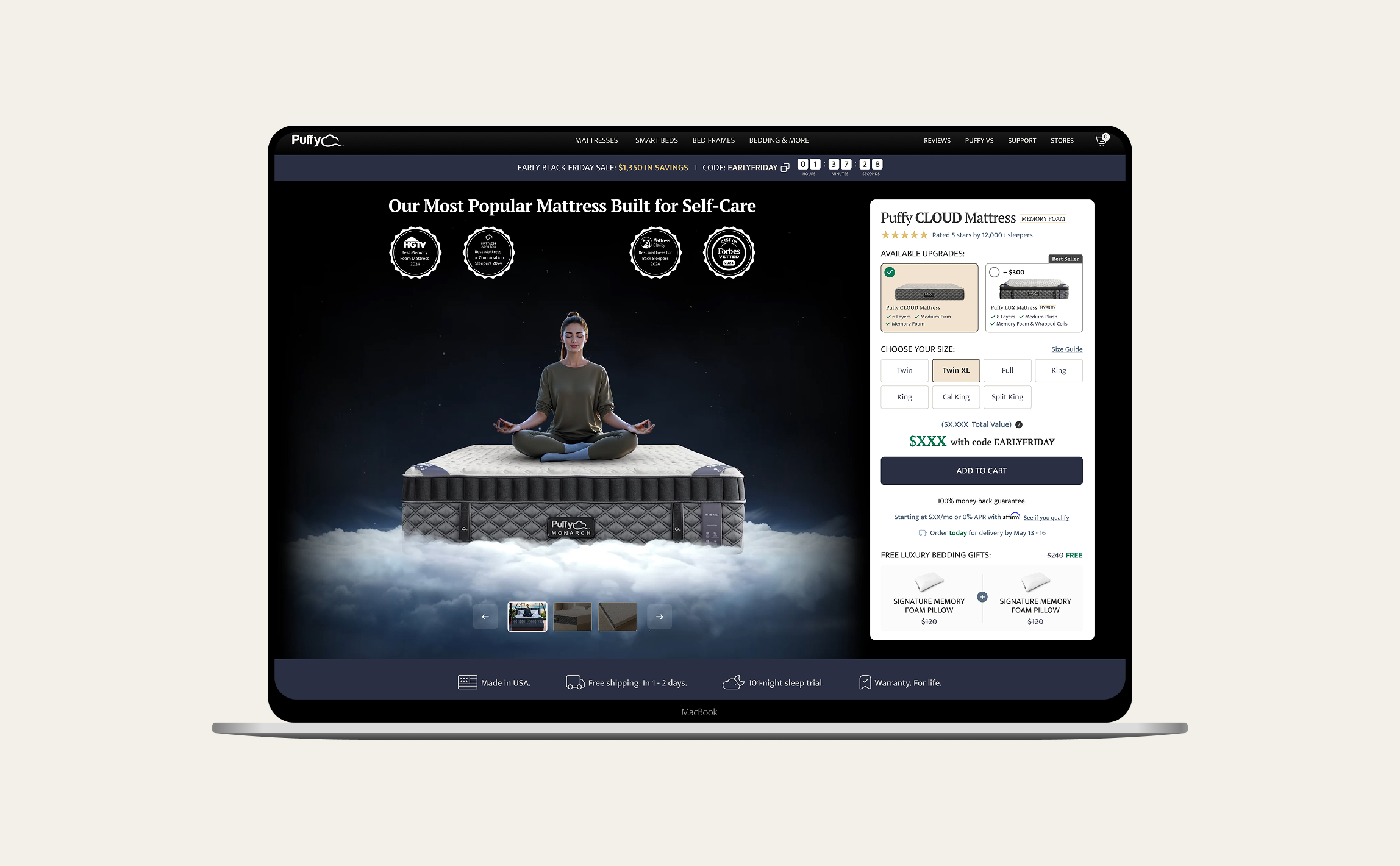
Always-On Hero Experiments Fuel Revenue Gains
4. A/B TESTING PROGRAMME
We keep the hero fresh by cycling multiple visual directions across hundreds of thousands of visits. Live behavioural data tells us what works. Each month we roll those learnings into a first-fold refresh so the page always matches shoppers’ mood and the season.
Benefit-Led Ads That Stop the Scroll
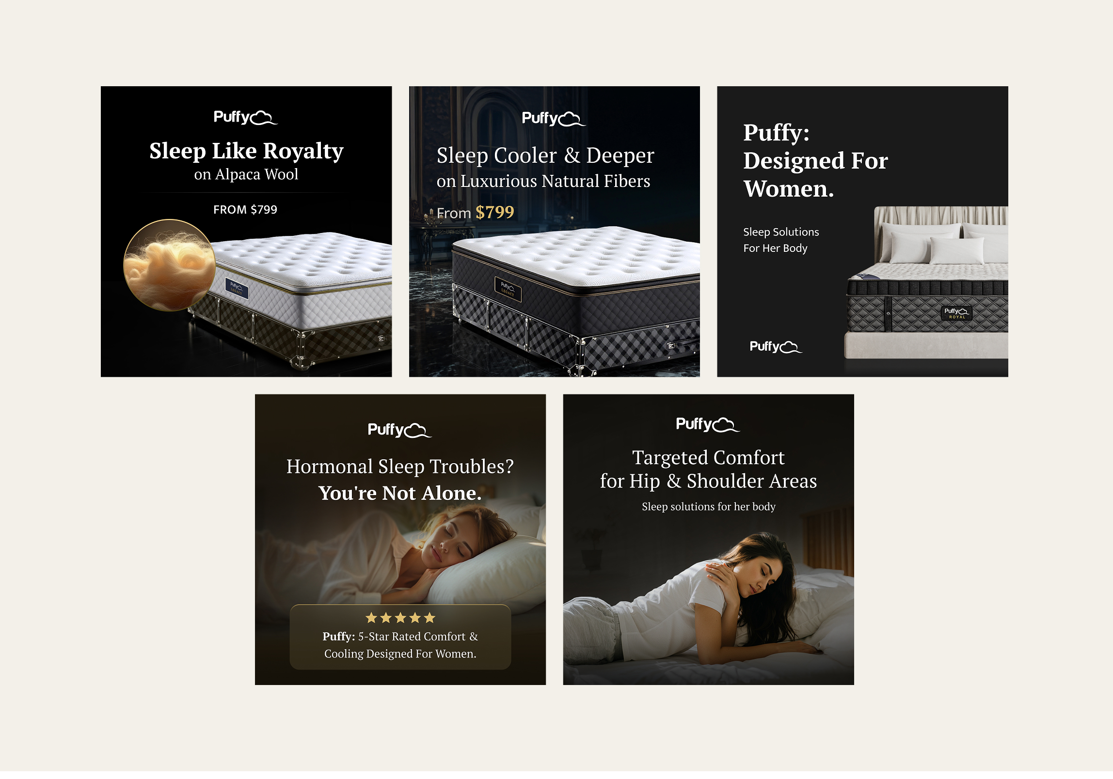
5. BENEFIT-LED AD DESIGNS
We created a flexible ad toolkit anchored to two story pillars: premium materials and personalised comfort. Each template combines a benefit-led headline, rich product imagery, and a simple call to action, making it easy to mix-and-match visuals and copy for any audience or season.
This modular approach keeps production fast, messaging consistent, and every ad squarely focused on why Puffy feels better.
Always-On Refinement Sharpens Every Release
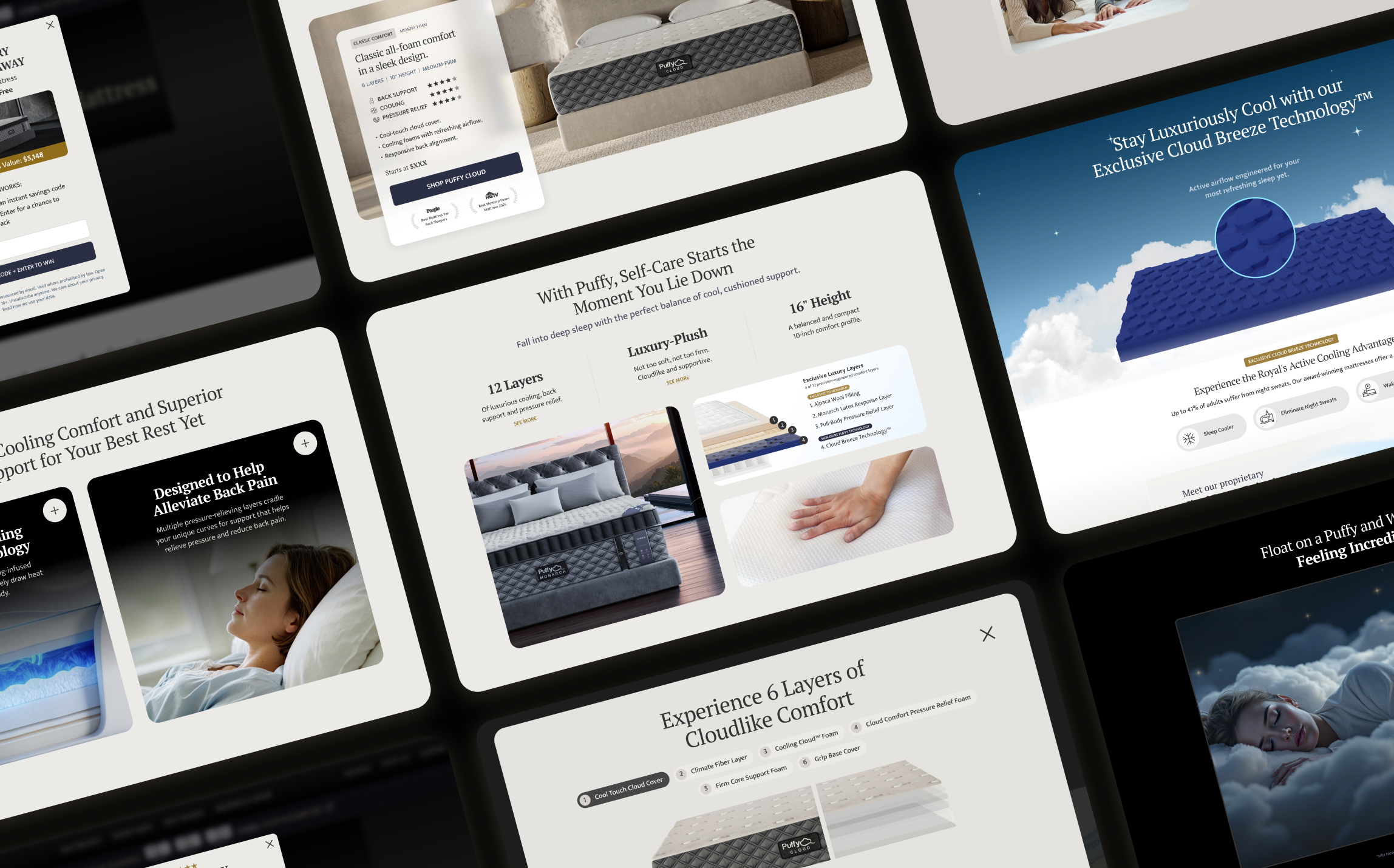
CONTINUOUS POLISH, CONSISTENT PREMIUM FEEL
We continually fine-tune every design component.
Ongoing feedback loops and data-driven tweaks keep each release sharper, richer, and on-brand.
Outcome Highlights
The numbers behind Puffy’s redesign success
−14%
Cart abandonment
The coupon box moved to review, ending mid-flow deal hunting.
+21%
Mobile checkout conversion
Two-step, thumb-first flow, validated by A/B test.
+67%
YoY revenue
Luxury positioning and a streamlined checkout drove higher AOV.
Consistently came up with out of the box design solutions and took ownership of them end to end. Designs implemented have had positive impact on user experience and bottom line growth.
Arthur Andreasyan
Puffy, Founder. USA
Next Case Studies
ProUX
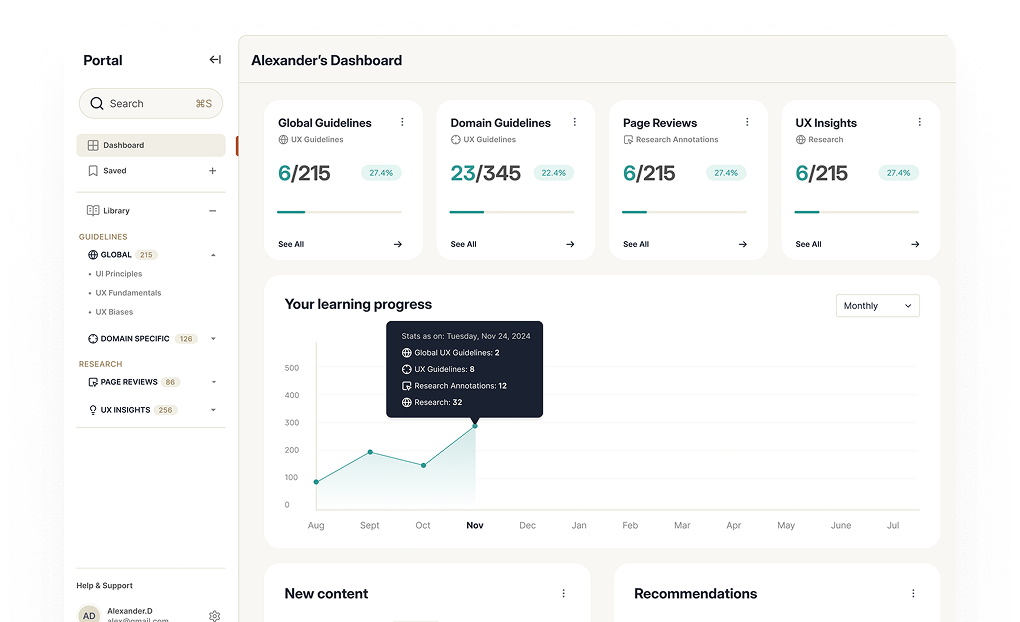
Developed a system to help designers grow their skills.
- My own AI product, designed and shipped end to end
- RAG-grounded on 19 years of UX practice
Purpose Mobile App
Purpose: A Mobile-First Approach to Distance Learning
- +45% Higher Daily Engagement
- +25% Increase in Course Completion