Conversion is won on the product page. Not on the ad.
You pay for the traffic. Shoppers reach your store, on a phone, and leave. I find why, and rebuild the store around why they buy, in 3 to 4 weeks. Not a redesign: every change answers a reason they leave.
30 minutes. No pitch. Nothing to pay before the proposal.Proposal within 48 hours of the call.
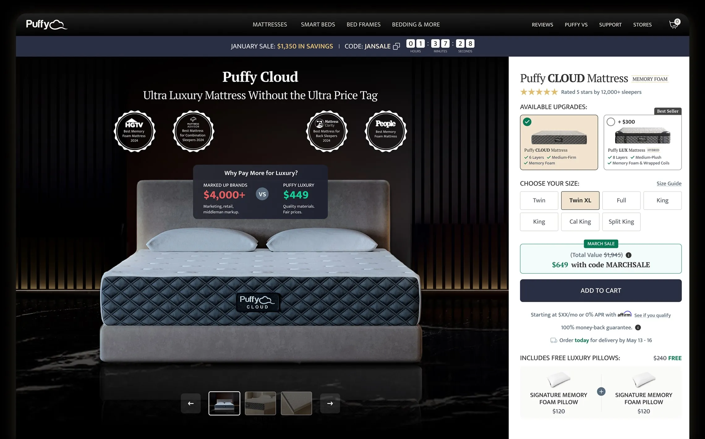
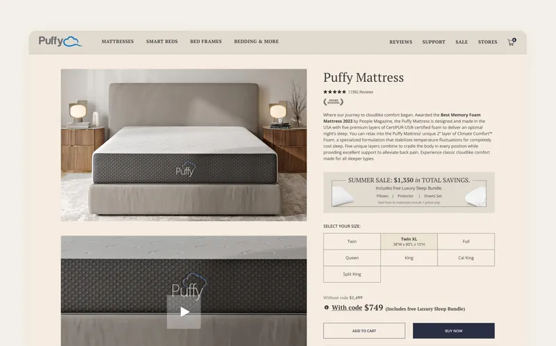
The page explained the mattress before it gave a reason to buy.
Product page
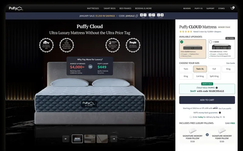
Puffy · product page · Before: the live page · After: my design
After 1 2 3
BeforeAfter
1 Proof before the pitch
Awards and a 5-star rating open the page.
2 Buy in 1 view
Size, price and Add to cart sit together in the first screen.
3 Risk removed at the button
Money-back guarantee and the delivery date sit under Add to cart.
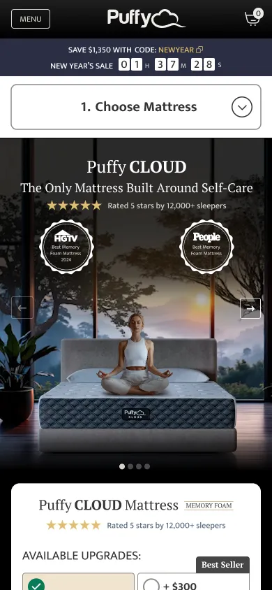
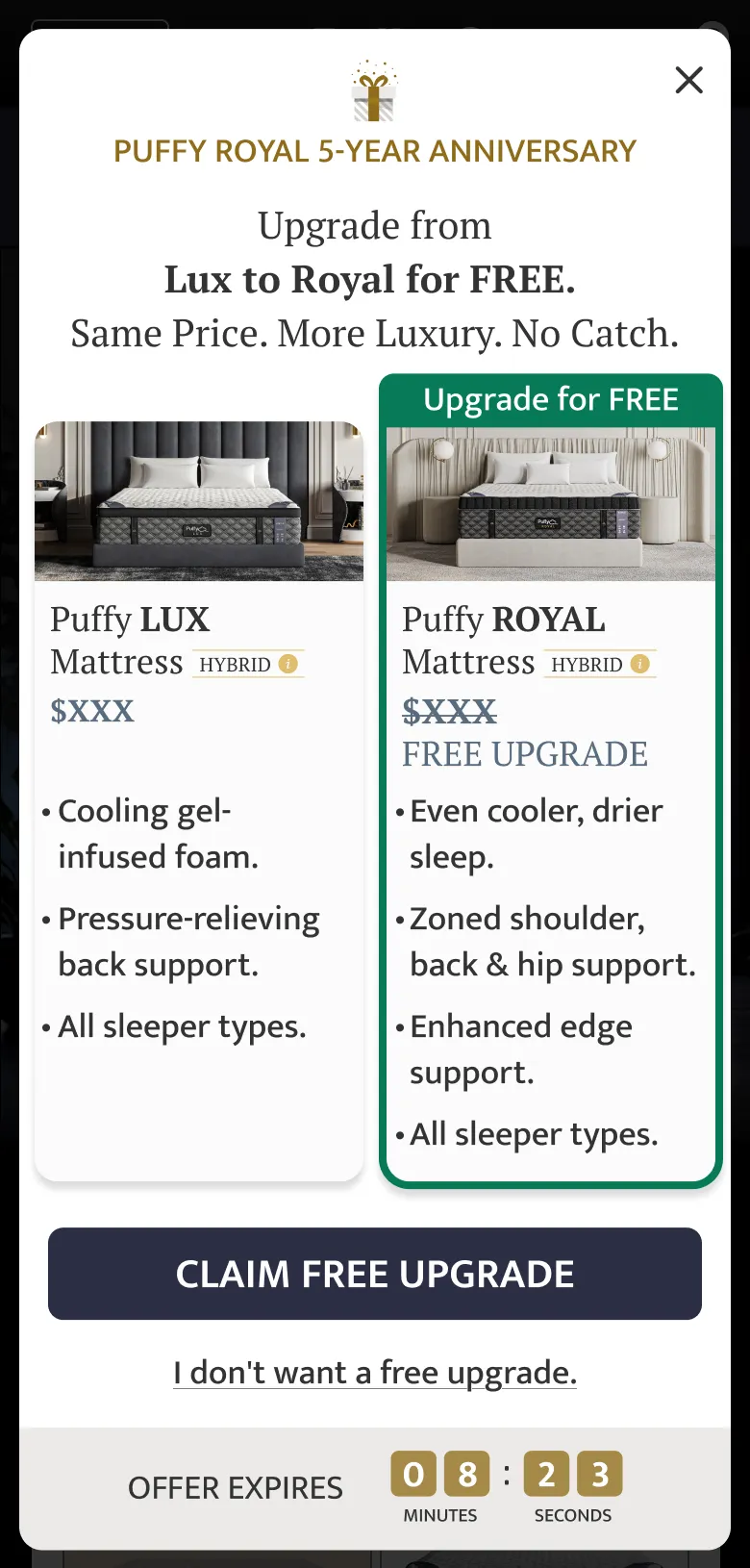
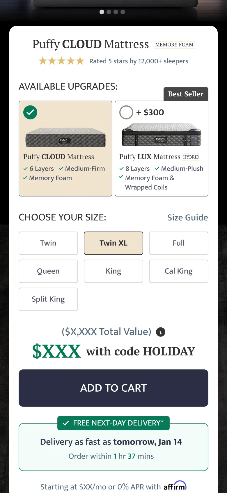
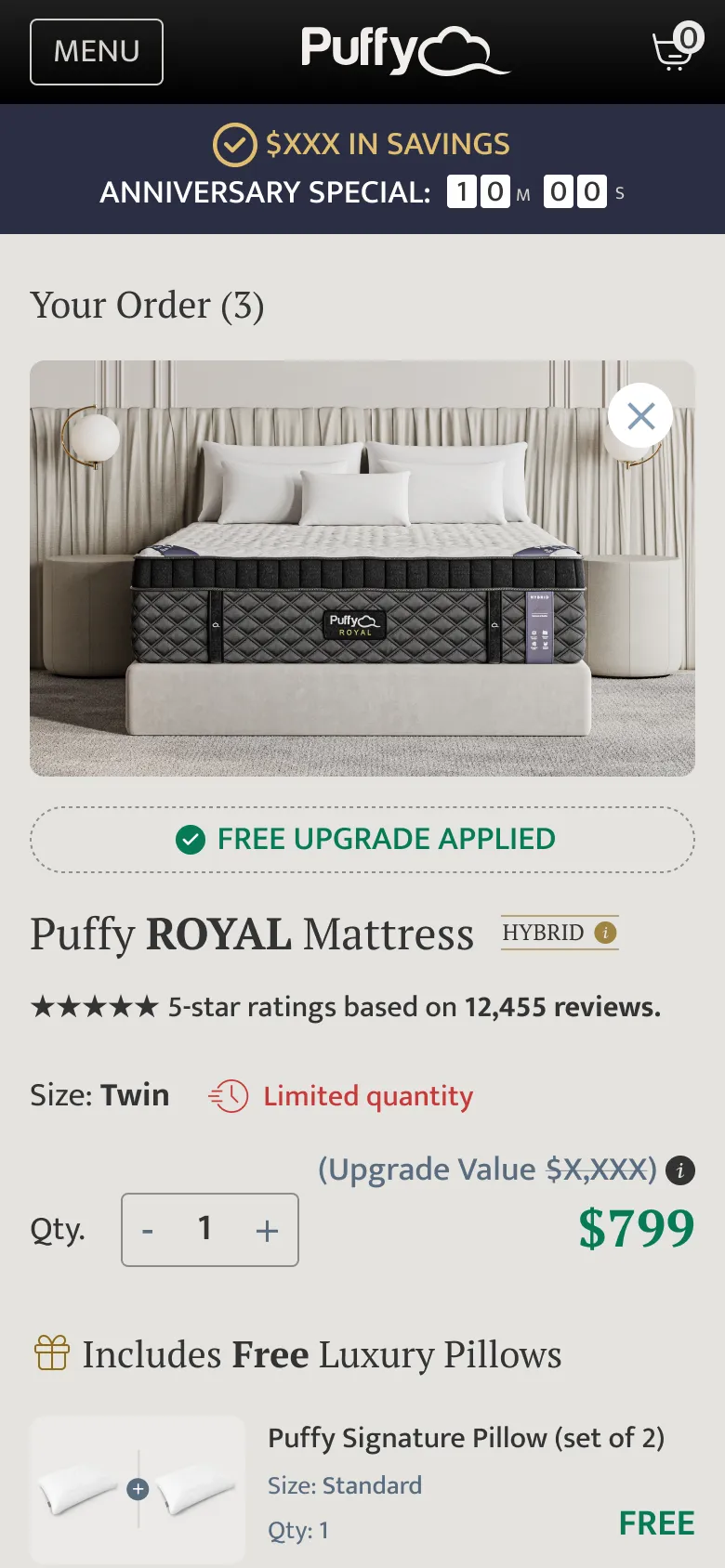
The same store, on a phone: the path to the order
1 · Product page
2 · Upgrade offer
3 · Add to cart
4 · Checkout
4 1 step at a time
A numbered guide turns a long page into 3 short decisions.
5 An honest no
The upgrade has a plain decline link, not a guilt trip.
6 Answer “when” at the button
The delivery date sits right under Add to cart.
Most shoppers arrive on a phone, with 1 thumb and little patience.
Mobile
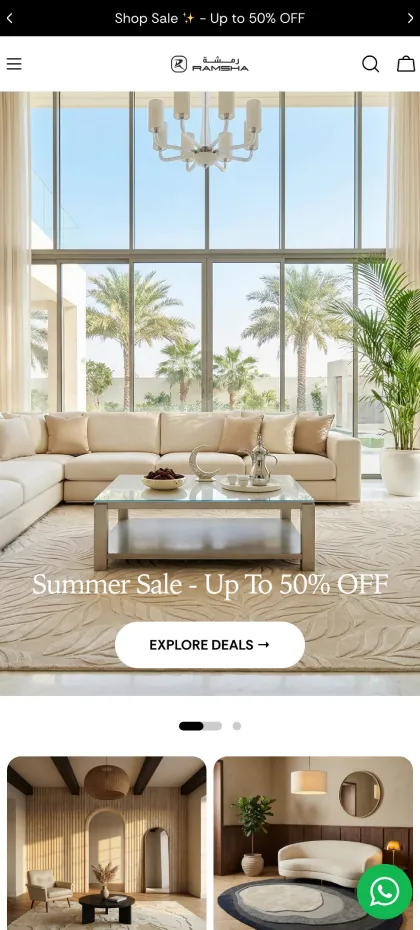
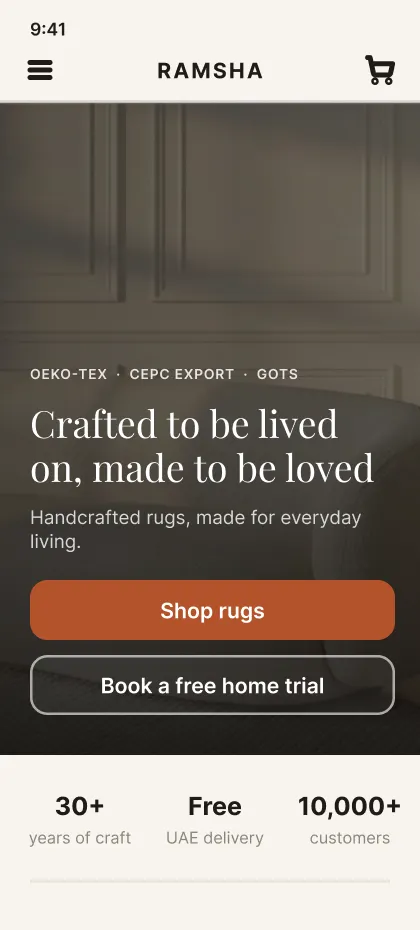
Ramsha Home, on a phone · Before: the live site · After: my designs
The first screen of the homepage
Home · beforeHome · after 1 2 3
Before: a sale banner and 1 button. Nothing says why to trust the store.
1 Trust above the headline
Certifications sit before the brand line.
2 2 clear actions
Shop, or book a free home trial.
3 Proof before the first scroll
30+ years, free delivery, 10,000+ customers.
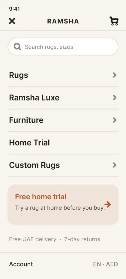
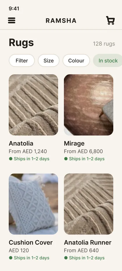
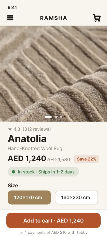
The path to the order
Menu
5 clear doors, search on top, the home trial 1 tap away.
Browse
Filters first. Price and delivery on every tile.
Product page
Price, delivery date and Add to cart in the first screen.
Cart
Savings, total and returns show before checkout.
Every page in the build is designed for the phone first.
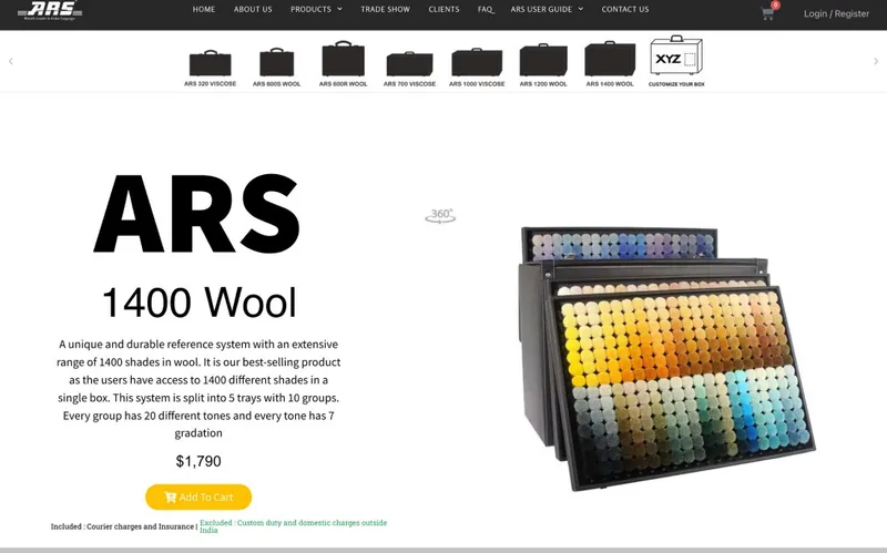
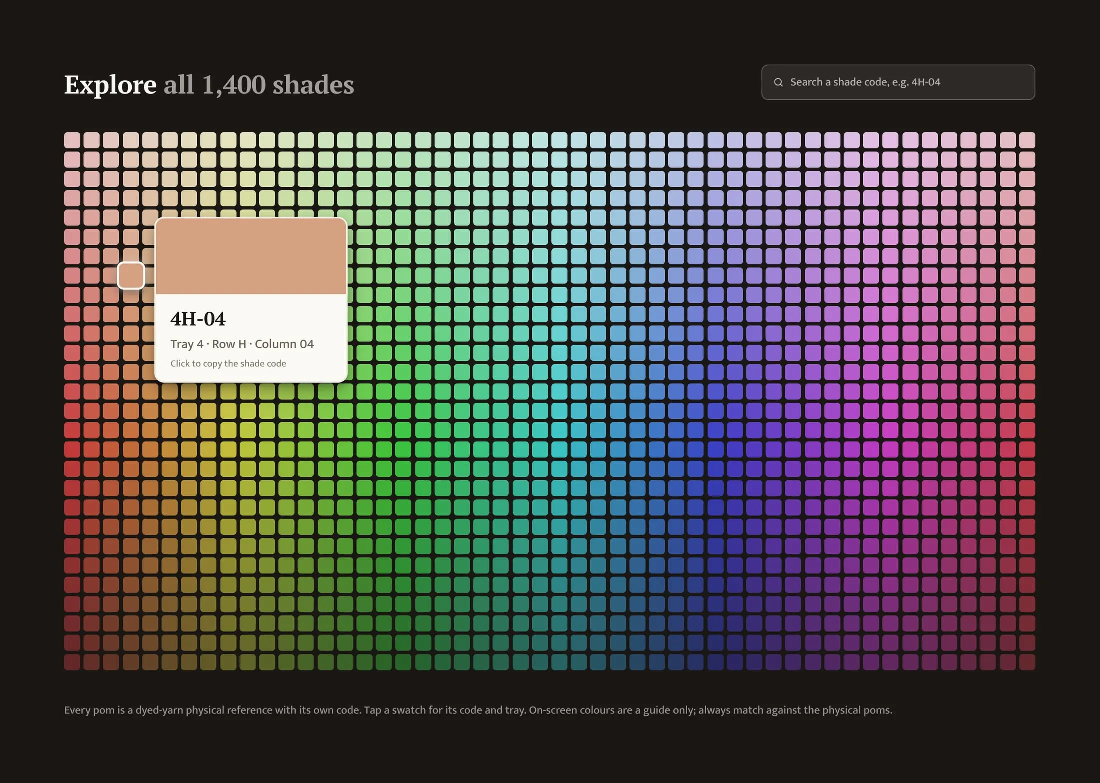
1,400 shades and 7 colour systems, sold from 1 flat page.
Too much to choose
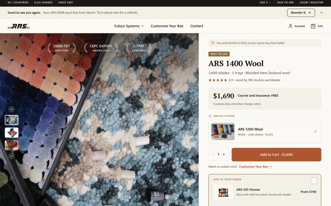
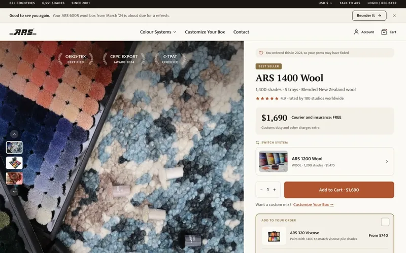
ARS Colours · product page · Before: the live page · After: my design
After 1 2 3
BeforeAfter
1 The price tells the whole cost
Courier and insurance free. Customs named as extra.
2 Compare in 1 tap
Switch system sits beside the price, not on another page.
3 The add-on arrives at the right moment
Offered at the moment of buying, not before.
How 1,400 shades stay findable
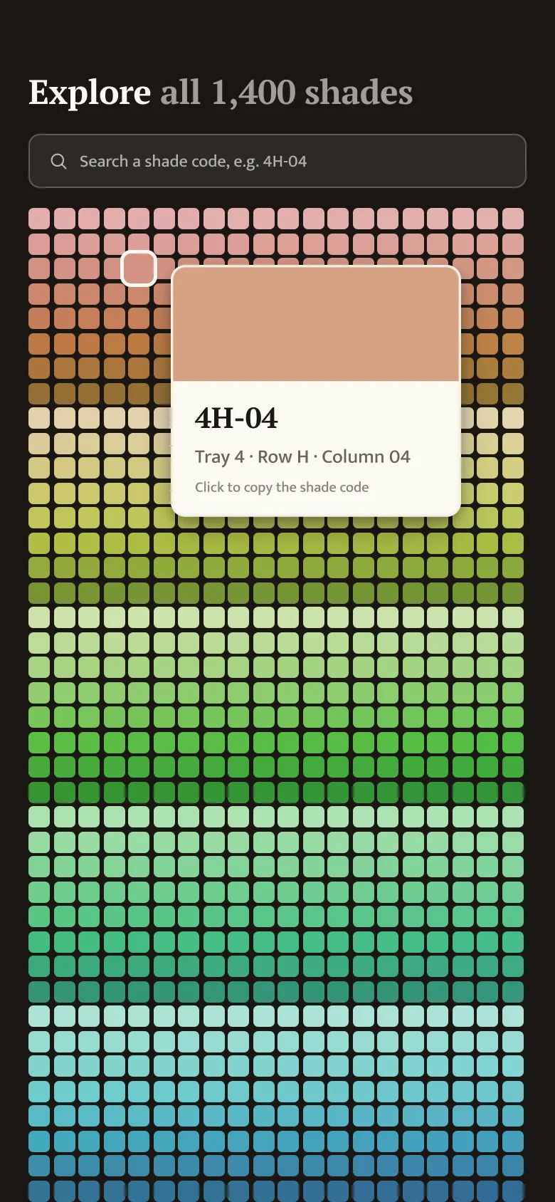
4 See all 1,400 at once
Every shade sits in one hue-ordered grid, not across 5 tray pages.
5 Search by code
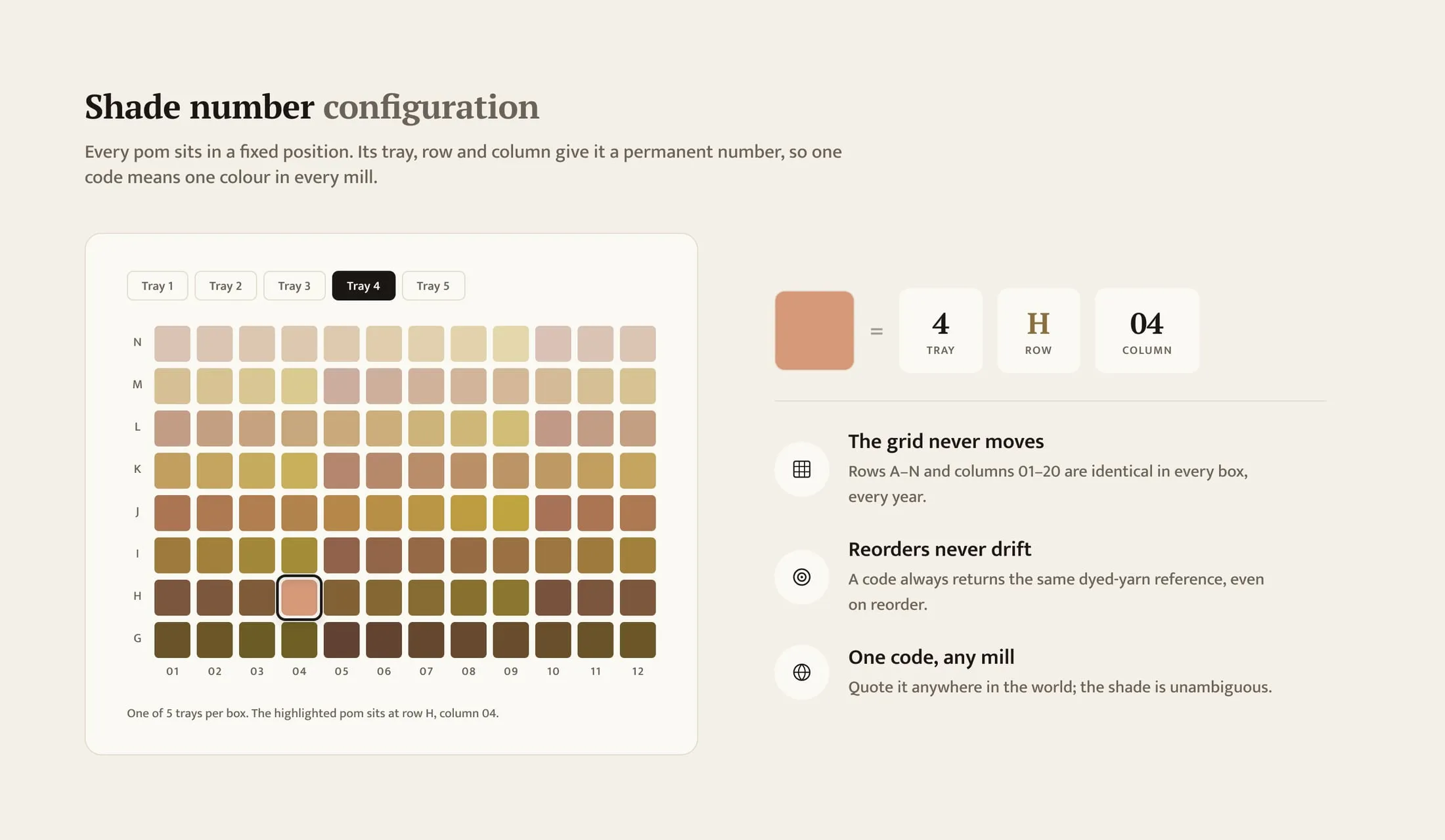
Type a code like 4H-04 to jump straight to one shade.
6 One code, one colour
Tray, row and column fix every shade’s number for good.
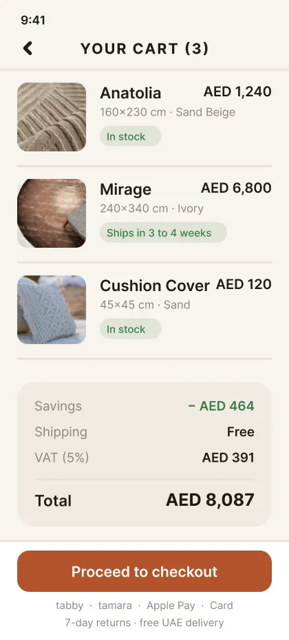
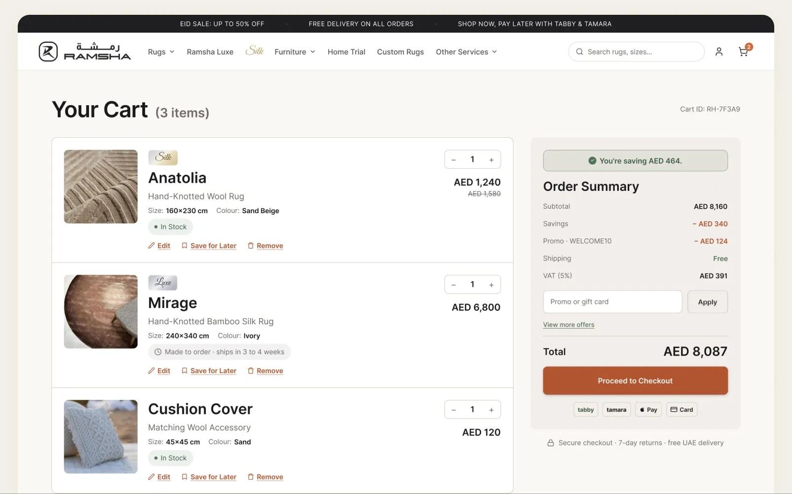
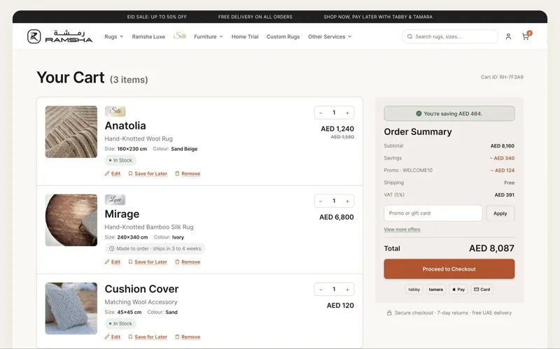
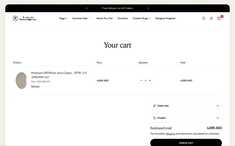
Shipping and discounts were “calculated at checkout”. The cart gave no reason to continue.
Cart
Ramsha Home · cart · Before: the live page · After: my design
After 1 2 3
BeforeAfter
1 No surprises at checkout
Savings, shipping and VAT show before the button.
2 Stock on every item
In stock, or the exact lead time.
3 Trust under the button
Payment options and 7-day returns, where the doubt happens.
Where stores leak
Brands spent 13.2% more on ads last year. Conversion fell 6.1%. These 4 moments lose the visit.
Source: Contentsquare, 2025 Digital Experience Benchmark, 6,000 websites
A product card under a spotlight on a plinth, shoppers walking awayPRODUCT PAGE
They land. They don’t buy.
The page explains the product before it gives a reason to buy.
A receipt rising from a till, a shopper with a cart turning awayCART AND CHECKOUT
The total changes at the last step.
Shipping and fees appear at checkout. So does the exit.
A hand holding a phone, a thumb near the buy buttonMOBILE
1 thumb. Little patience.
Most shoppers arrive on a phone. Most stores are designed on a desktop.
A plain dark storefront that lights up gold, a crest appears on the door, a shopper turns to walk inBRAND POSITIONING
Looks like any store. Sells like one too.
Positioning, branding and identity make a store feel premium. Without them, shoppers compare on price alone.
How I fix it
The same 5 steps on every store, from the first leak to the handover.
01
ILLUSTRATIVE DATA
funnel· mobile
Product page100%Add to cart9%91 of 100 leave hereCheckout5%Paid2%
Leak found
session notes
0:08scrolls past the photo
0:14looks for a delivery date
0:21leaves
STEP 01 · FIND
Your data shows where they stop. I find the page that leaks most.
1 page, picked by the numbers, not by taste.
Analytics
Session recordings
Funnel by device
30-minute call
02
USABILITY
blocks found
Size guide behind a link
Add to cart below the fold
23 form fields for 1 order
Clear to buy
the fix
Size guide opens in place
Button in the first screen
Guest checkout, fewer fields
STEP 02 · CAN THEY BUY?
Remove what blocks the purchase.
Usability: the size guide, the button, the form.
Size guide in place
Button in the first screen
Fewer fields
HFI CUA
03
PERSUASION · EMOTION · TRUST
PET review
P Persuasion Was AED 1,580. Now AED 1,240.
E Emotion Ships in 1–2 days. No guessing.
T Trust 7-day returns, said by the button.
Placed on purpose
product page· after
AnatoliaHand-knotted wool rug
AED 1,240AED 1,580Save 22%
In stock · Ships in 1–2 days Add to cart · AED 1,2407-day returns · free UAE delivery
STEP 03 · WILL THEY BUY?
Give a reason to buy. Then remove the fear.
Persuasion, emotion and trust, placed on purpose.
Anchoring
Delivery date
Returns by the button
HFI CDPA
04
PHONE FIRST
product page· phone
Handover
specs· for your developers
priceInter 600 · 20/24
buttonh 48 · radius 8 · full width
deliveryabove the button
returnsunder the button
tap target44pt minimum
Front-end code
STEP 04 · DESIGN
1 fix, designed for the phone first.
The front-end design, coded and ready for your developers.
Mobile first
Front-end code
Brand positioning
Week 3 to 4
05
YOUR TEAM RUNS IT
test plan
numberAdd-to-cart rate, mobile
methodA/B test, 50/50 split
orUsability test, 10 to 20 people
winB beats A on the 1 number
Test plan
A/B test
ACurrent page
BThe fix
The result is yours to measure. The plan says what counts as a win.
STEP 05 · TEST
Your team tests it. You judge it by 1 number.
An A/B test, or a usability test with 10 to 20 people. You see what lost, and why.
Test plan
1 number
A/B test
Usability test
Built around your buyer.
Every page in the build answers a reason shoppers leave, in the order they meet it.
Typical vs designed
The same product page, read through the shopper’s mind. What they feel decides whether they buy.
Topic
A typical product pageThe shopper has to work it out
Store that convertsAnatolia ★ 4.8 (312 reviews)
AED 1,240 1,580Ships in 1–2 daysAdd to cart 7-day returns · free delivery A page I design Built on buyer psychology
Clarity
Where do I look?Price, size and delivery are spread down the page.
Clear in 5 secondsPrice, delivery date and Add to cart in 1 view.
Effort
Hunting for answersSize guide, shipping and returns sit behind links.
Answers in placeEach question is answered where it comes up.
Emotion
DoubtNo date and no total, so the shopper stops to think.
Anticipation“Arrives Thursday” lets them picture it at home.
Persuasion
No reason to actEvery option has the same weight.
1 clear reasonThe saving and 1 clear default sit beside the button.
Trust
“Is this real?”Returns hide in the footer. 3 reviews, all 5 stars.
Proof at the doubtRating, returns and safe payment sit by the button.
Checkout
A surpriseShipping and fees appear at the last step.
No surprisesTotal, VAT and delivery show before checkout.
The build fixes all of these, in the order that costs you most.
How it works
1 call. A proposal in 48 hours. Your store rebuilt in 3 to 4 weeks.
October 2026
Dubai · Mon to Fri
MonMTueTWedWThuTFriFSatSSunS
5CallCallProposalProposal
6CallCallProposalProposal
7CallCallProposalProposal
8CallCallProposalProposal
9CallCallProposalProposal
10
11
12ProposalProposal
13ProposalProposal
14ProposalProposal
15ProposalProposal
16ProposalProposal
17
18
Book today. Call Mon 5 Oct. Your proposal by Wed 7 Oct.
4.98/5 from 300+ founders
Trusted by founders
The work, in the words of the people who paid for it.
+21%mobile checkout conversion
Consistently came up with out of the box design solutions and took ownership of them end to end. Designs implemented have had positive impact on user experience and bottom line growth.
Arthur AndreasyanFounder, Puffy
3 monthsdesign to market
I've worked with Surinder for nearly a decade, and he's become both a trusted friend and the most talented UI/UX engineer on my team. He consistently delivers on time often ahead of schedule and his professionalism is unmatched. Surinder led the design for our Medellín launch, producing exceptional user experiences that took the product to market in record time.
Carlos AriasFounder, Medellin.co
On timeevery time
While Surinder is a very talented designer, what I appreciate most about him professionally is his tenacity and dependability. If he says he will do something, there's no question that it will get done.
No. A redesign changes how a store looks. This build changes why shoppers buy: every page answers a reason they leave, in the order they meet it. Only about 10 to 15% of A/B tests win, so each change ships with a test plan, and you see the ones that lose too.
Best fit: steady paid traffic, a store that looks like any other, and a developer or agency who can connect the backend. Not sure? The call tells you in 30 minutes.
Yes. The build is designed for your platform. Some checkout changes need Shopify Plus, and I check that before work starts.
Client numbers stay private. The designs are above, before and after. My own record: +67% YoY revenue at a $1B+ DTC brand, and +21% mobile checkout conversion, validated by A/B test.
I hand over the design and the front-end code, page by page. Your developer or Shopify agency connects the backend: products, payments and data.
Access to your analytics and your store, plus session recordings if you have them. And 1 review call a week.
50% after the call, once the scope and price are agreed in the proposal. 50% on handover, when the front-end design and code are yours.
You get a test plan with the numbers to judge the build by. Run it as an A/B test, or a usability test with 10 to 20 people. If a page does not win, you know why, and what to test next.
You can keep going monthly: $8,000 a month for 3 flows plus 1 measure week. Month to month, no minimum term.
I'm Surinder's AI assistant, trained on everything he's published here. Ask me anything about the work, the process, or pricing. I answer from this site, nothing else.